Empowering a new brand for the growing startup sibill, the digital cash flow solution for small businesses.
Art direction: Alex Foradori, Nicolò de Biasio
Video and Animation: Alex Foradori
Company website: Alex Foradori
Graphic design: Alex Foradori, Nicolò de Biasio


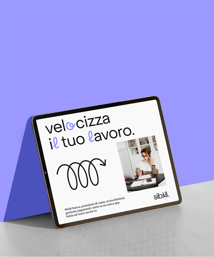
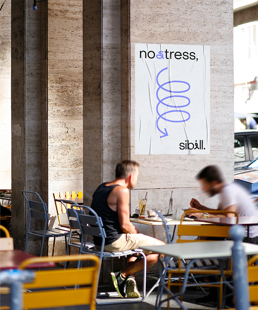
Were the cash flowww
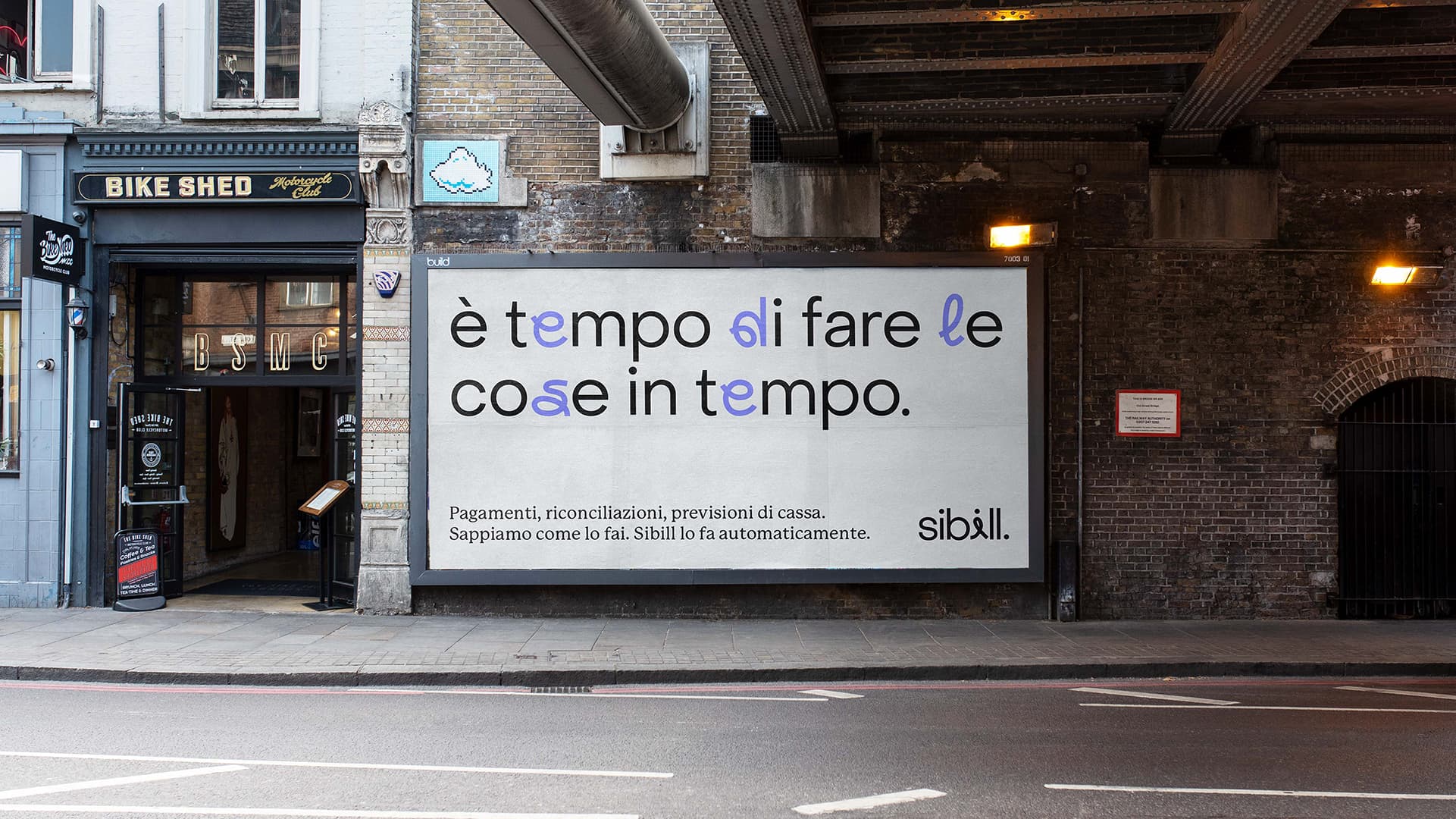
Once upon a time companies were used to manage the cash flow manually, now Sibill facilitates the reconciliation between invoices and transactions and ensures the payment and collection of invoices by the due date. Sibill’s aim is to simplify cash flow monitoring, through its data aggregation platform that automatically pulls together cash flow impacting data sourcesThe differentiating factor is that Sibill makes sure everything can be automated.

Before
After



The new brand starts here
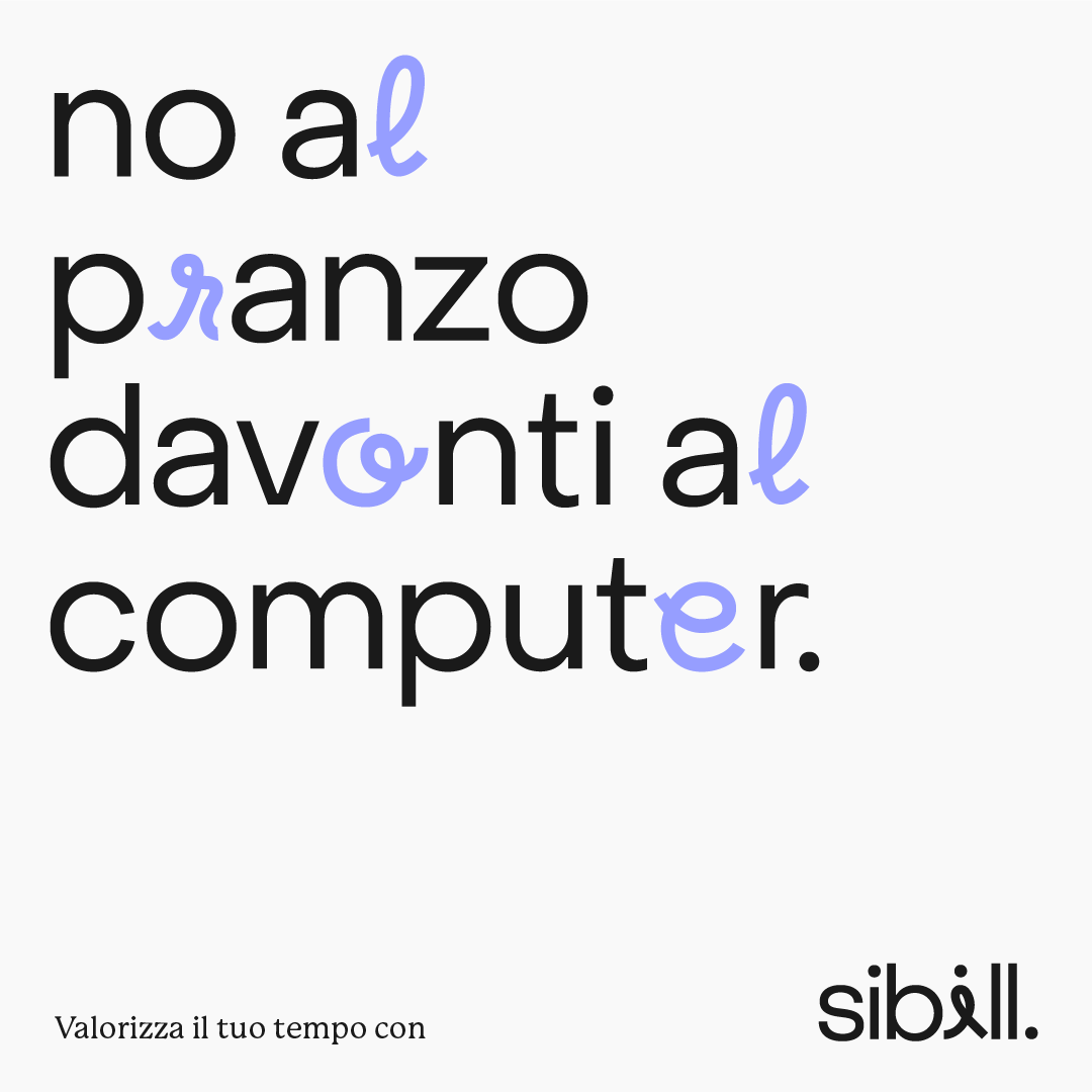
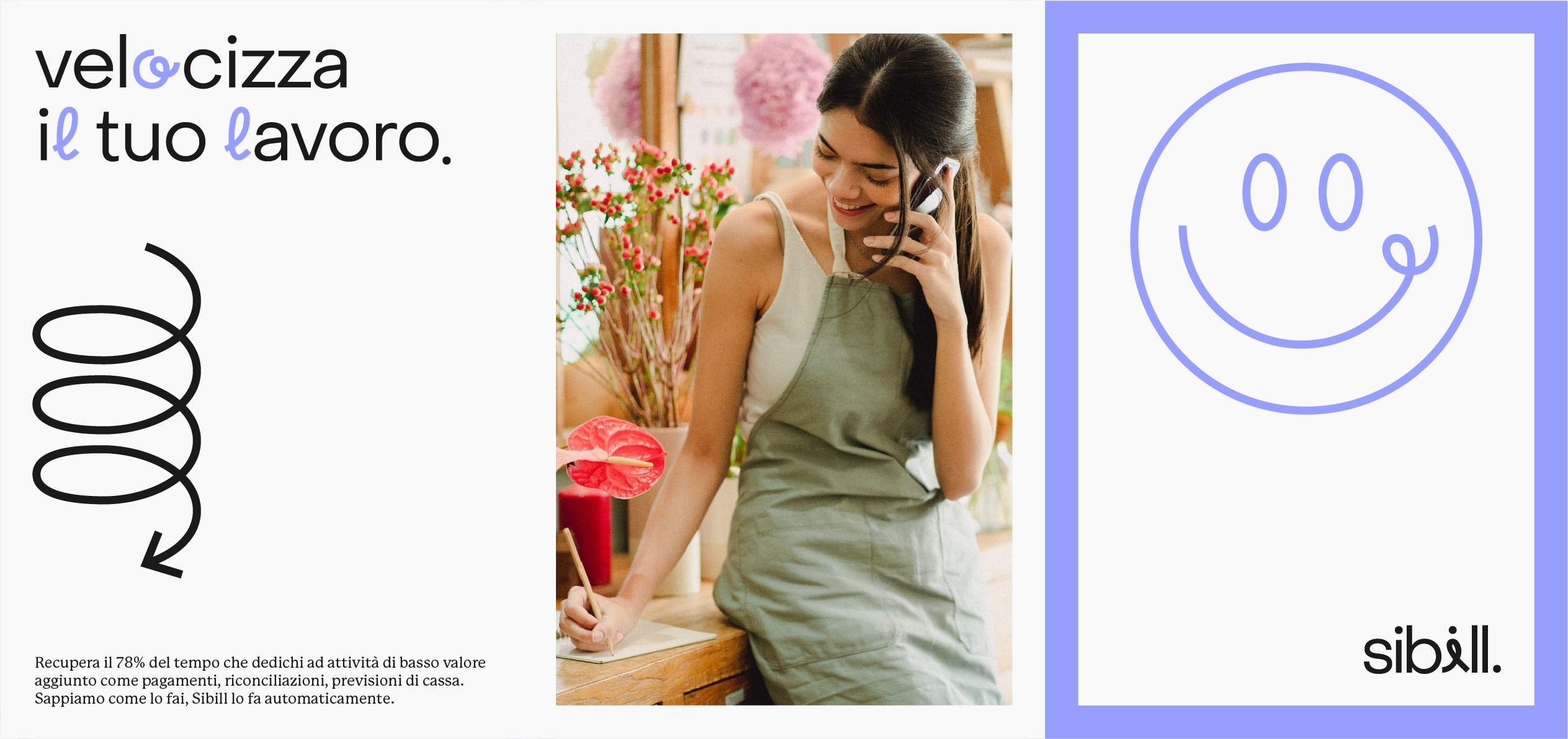
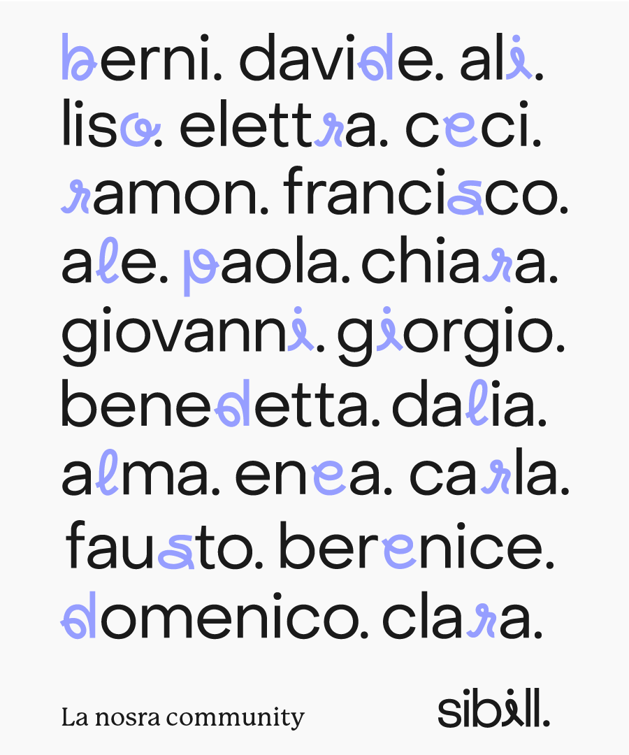
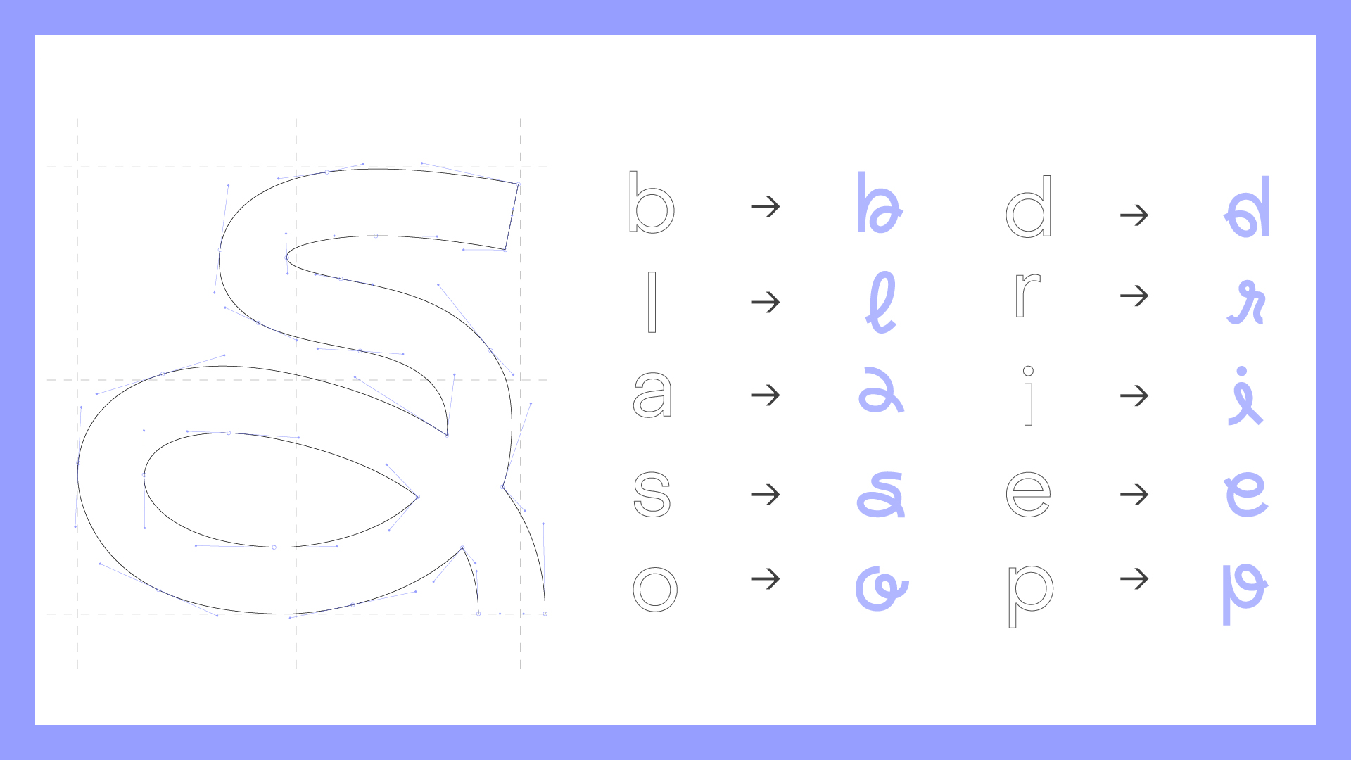
The key asset we created is a new bespoke wordmarque. Understated yet distinctive, the aim was for it to be a strong and confident sign off for the ever-growing brand. We also created the “i” icon, designed to work as a clear and clean shorthand where needed, like on social channels and app icons and within the mobile experience. Both of these elements are supported by an evolved colour palette originating from the name of the brand: the sibyls were prophetesses or oracles in Ancient Greece, and their role translate into the core function of the product. Together with the “i” icon, a set of cutsomized and distinctive typographic characters bring the flexibility of the brand to a higher level, giving both a simple yet contemporary look.
The key asset we created is a new bespoke wordmarque. Understated yet distinctive, the aim was for it to be a strong and confident sign off for the ever-growing brand. We also created the “i” icon, designed to work as a clear and clean shorthand where needed, like on social channels and app icons and within the mobile experience. Both of these elements are supported by an evolved colour palette originating from the name of the brand: the sibyls were prophetesses or oracles in Ancient Greece, and their role translate into the core function of the product. Together with the “i” icon, a set of cutsomized and distinctive typographic characters bring the flexibility of the brand to a higher level, giving both a simple yet contemporary look.
A story of two voices
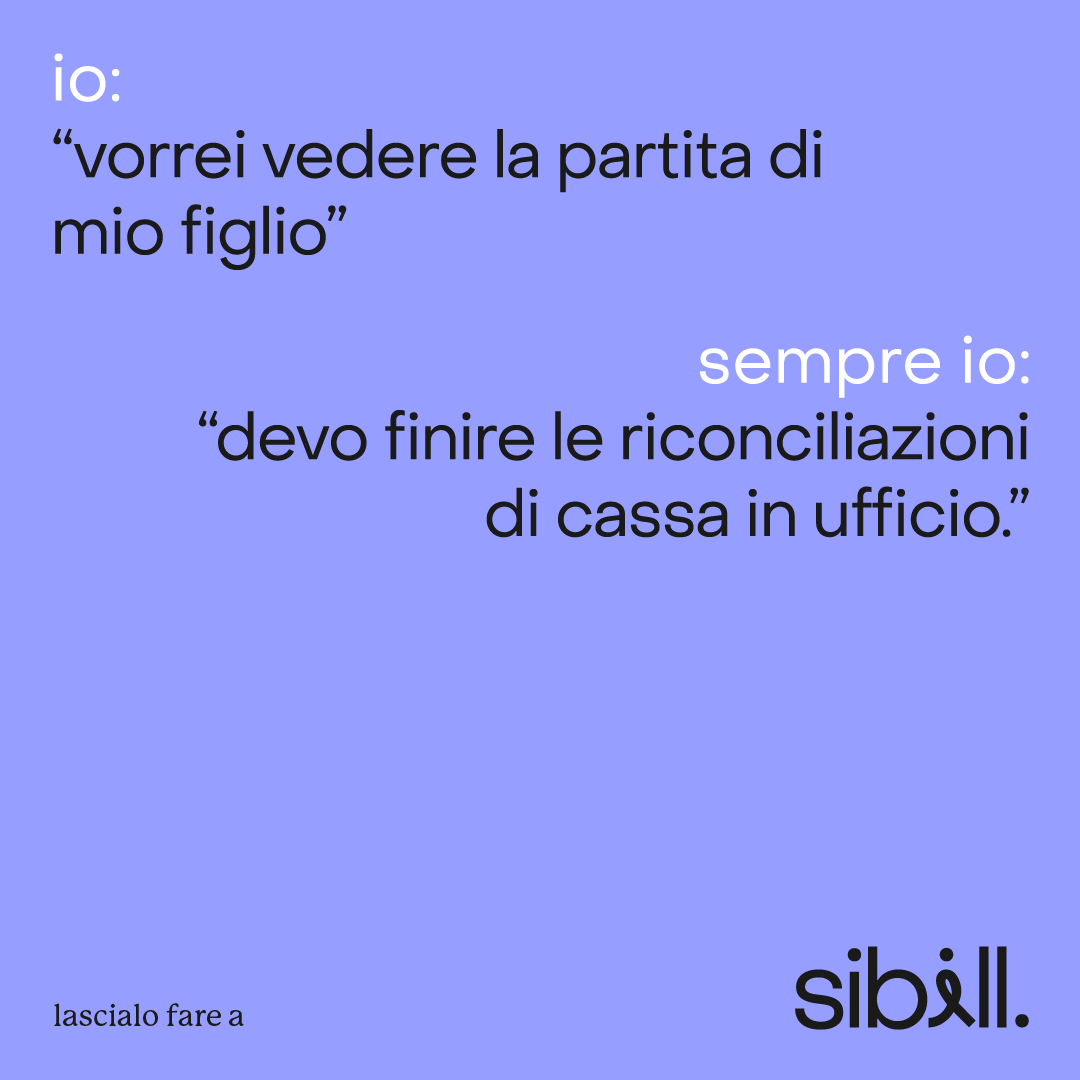
We created a new brand tone of voice that’s warm, but businesslike, giving the freedom to speak naturally to everyone, while keeping the technical aspects behind. This demanded a total typographic refresh. We chose Object Sans and P22 Mackinak Pro to introduce these contrasting and connected voices. They work together in a strong typographic system, so that they can look as good together as they do individually. Combining them in applications creates the ability to emphasize information and also to express different voices. Through a scalable motion design system, both the brand and the tone of voice comes to life with confidence.
We created a new brand tone of voice that’s warm, but businesslike, giving the freedom to speak naturally to everyone, while keeping the technical aspects behind. This demanded a total typographic refresh. We chose Object Sans and P22 Mackinak Pro to introduce these contrasting and connected voices. They work together in a strong typographic system, so that they can look as good together as they do individually. Combining them in applications creates the ability to emphasize information and also to express different voices. Through a scalable motion design system, both the brand and the tone of voice comes to life with confidence.
